61  Decomposition and Moving Averages: Practical

61.1 Introduction

In this session we will begin by demonstrating component analysis as a tool for understanding patterns within time-series data. We will then examine the use of moving averages as another way of simplifying time-series data.

This practical will also repeat some of the preparatory stages required for handling time-series data that we introduced last week.

61.2 Component analysis: demonstration

Component analysis involves decomposing the time-series into its constituent components, typically the trend, seasonality, and random or irregular components. We introduced this concept in a previous section.

There are two types of decomposition: ‘classical’ and ‘STL’.

The choice between classical decomposition and STL decomposition depends on the specific characteristics of your time series data and your analysis needs.

  • For simpler, more stable seasonal patterns, classical decomposition might suffice.

  • For more complex data, especially when the seasonal pattern changes over time or when the data contains outliers, STL decomposition (Seasonal and Trend decomposition using Loess) is often the preferred choice.

Classical decomposition: Swimming dataset

The first dataset contains daily swimming performance over a three-year period.

Load necessary libraries and dataset

rm(list=ls())
 
library(forecast)

df <- read.csv('https://www.dropbox.com/scl/fi/wb3t67831oe2j71u4znmk/tsa_forecast_02.csv?rlkey=0fzluocavie5eci0c7s6efstv&dl=1')

head(df)
        Date Performance
1 2020-01-01       30.69
2 2020-01-02       30.85
3 2020-01-03       31.74
4 2020-01-04       30.98
5 2020-01-05       31.00
6 2020-01-06       31.79

We are interested in monthly trends or patterns in this data. However, we can’t immediately use the ts function in this case, because there are different numbers of dates in different months.

We’ll introduce the xts package to handle this situation. It’s more flexible than ts.

I do two things in the following code.

  • First, I convert the Date variable to a date format (using the as.Date command which we learned last week).

  • Then, I create a time-series object (xts) using that date information.

library(xts)

# first, I'm going to tell R that one of my columns is a Date object
# I need to tell R the format the date is in
df$Date <- as.Date(df$Date, format = "%Y-%m-%d")

# Then, I create an xts object
swim_xts <- xts(df$Performance, order.by = df$Date)

Plot the original time series

plot(swim_xts, main = "Daily Observations", ylab = "Av. Time(sec)", xlab = "Date")

# the `quantmod` package has some nice visual options
library(quantmod)
chart_Series(swim_xts)

Decompose the time series

Now, I’m going to use the apply.weekly function to convert my data into a weekly format. This creates an object that’s based on the weekly average of the observations.

# Convert swim_xts to daily frequency using a custom summary, e.g., mean
swim_xts_weekly_mean <- apply.weekly(swim_xts, FUN = colMeans)

We’ll use classical decomposition which assumes an additive or multiplicative model.

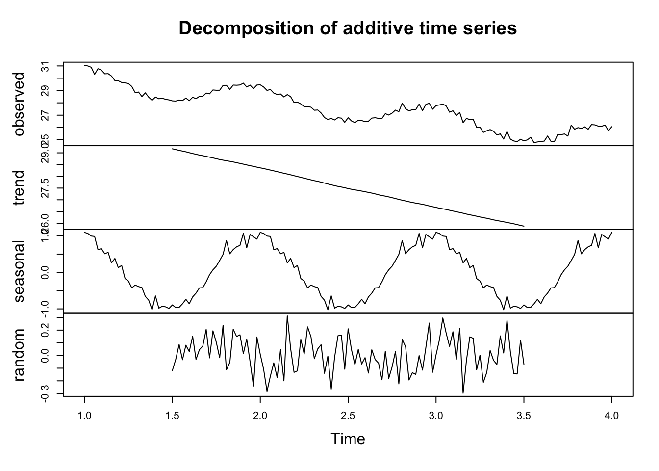
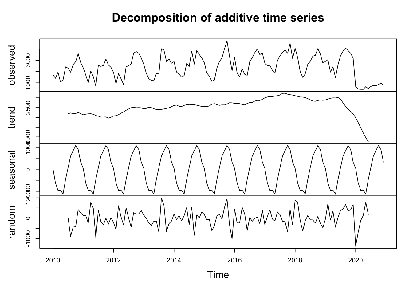
In an additive model, the observed time series is assumed to be a sum of the components. This is mathematically represented as: \[ Yt = Tt + St + It \]

where $Yt is the observed data, $Tt is the trend component, $St is the seasonal component, and $It is the irregular or residual component.

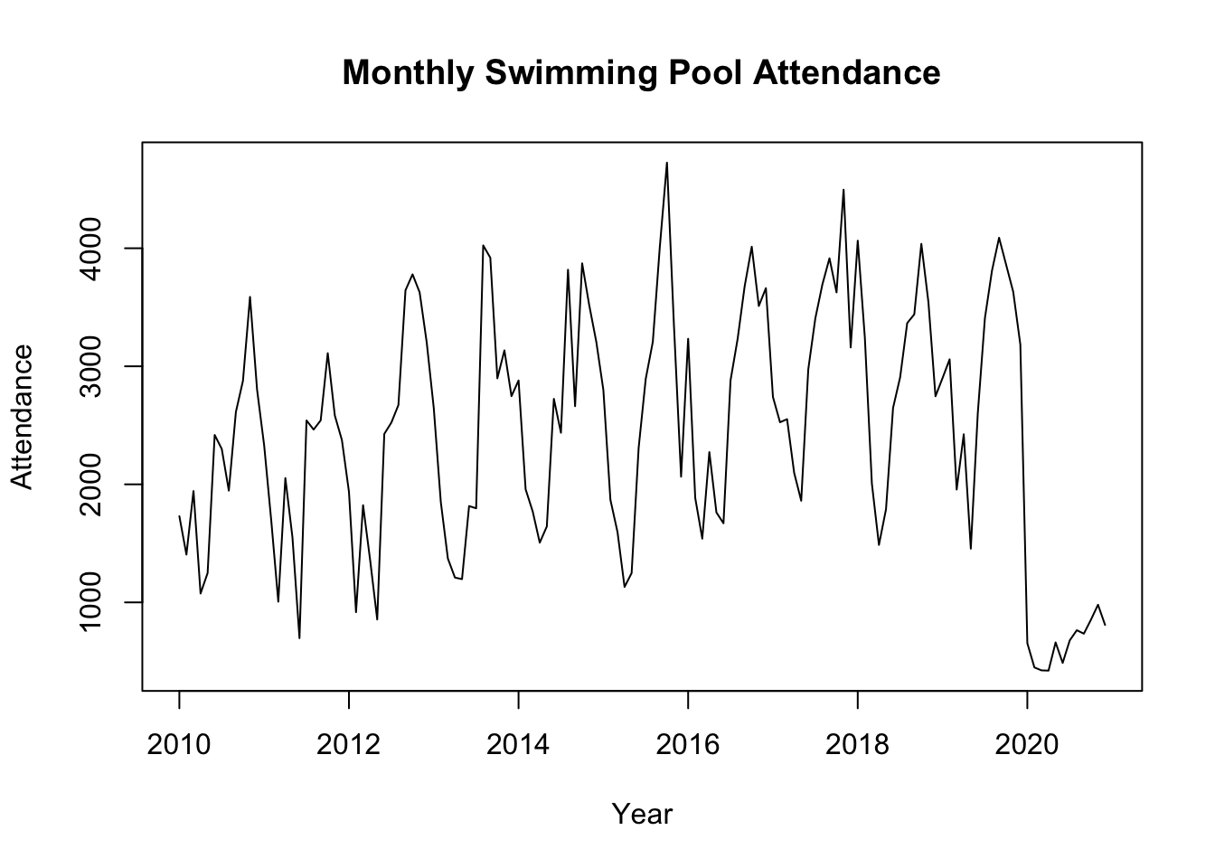
This model is typically used when the seasonal variations are roughly constant over time, meaning they do not change in proportion to the level of the time series.

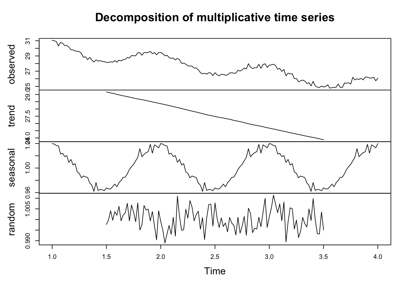
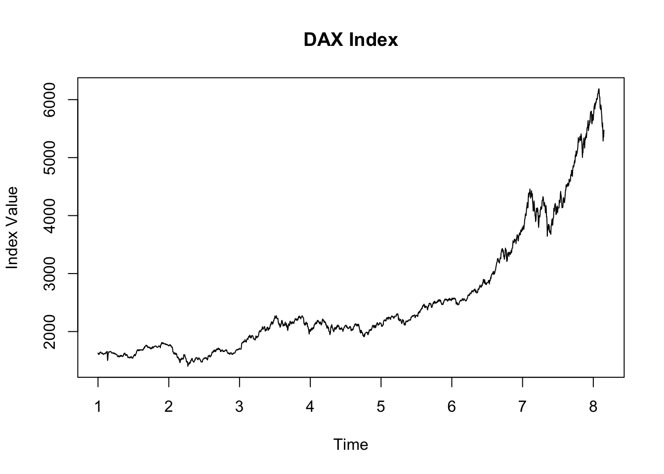
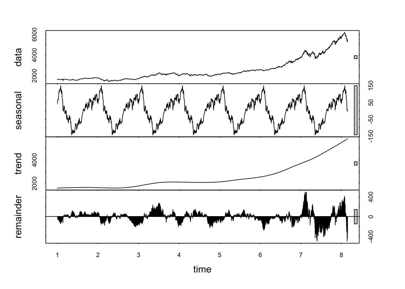
In a multiplicative model, the components are multiplied together instead of being added. The multiplicative model is represented as: \[ Yt =Tt × St × It \]

This model is suitable when the seasonal variations are changing proportionally with the level of the time series. In other words, the seasonal effect is a percentage of the trend, and thus, the seasonal amplitude increases or decreases over time as the data values increase or decrease.

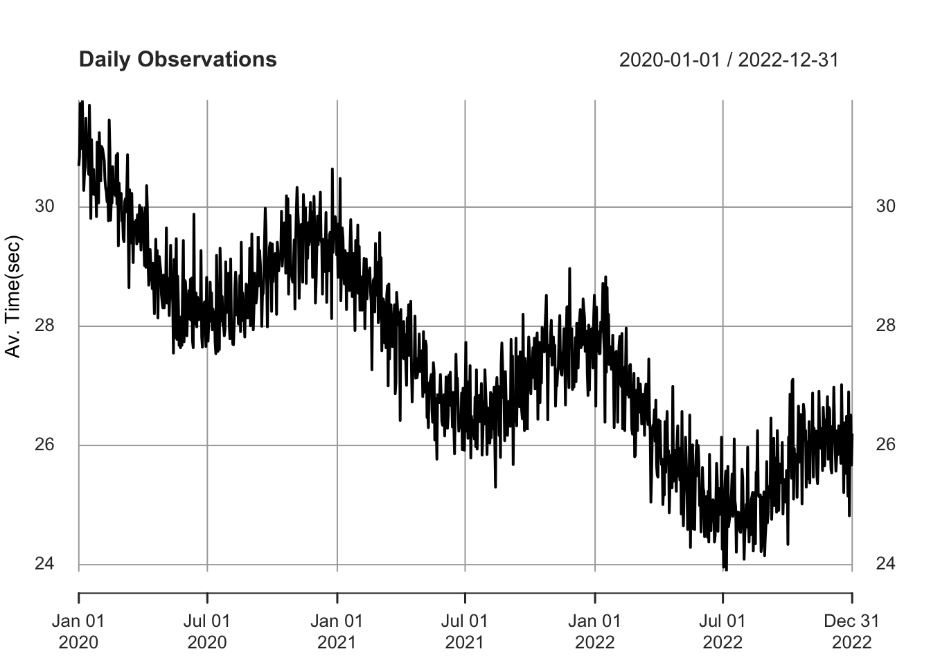
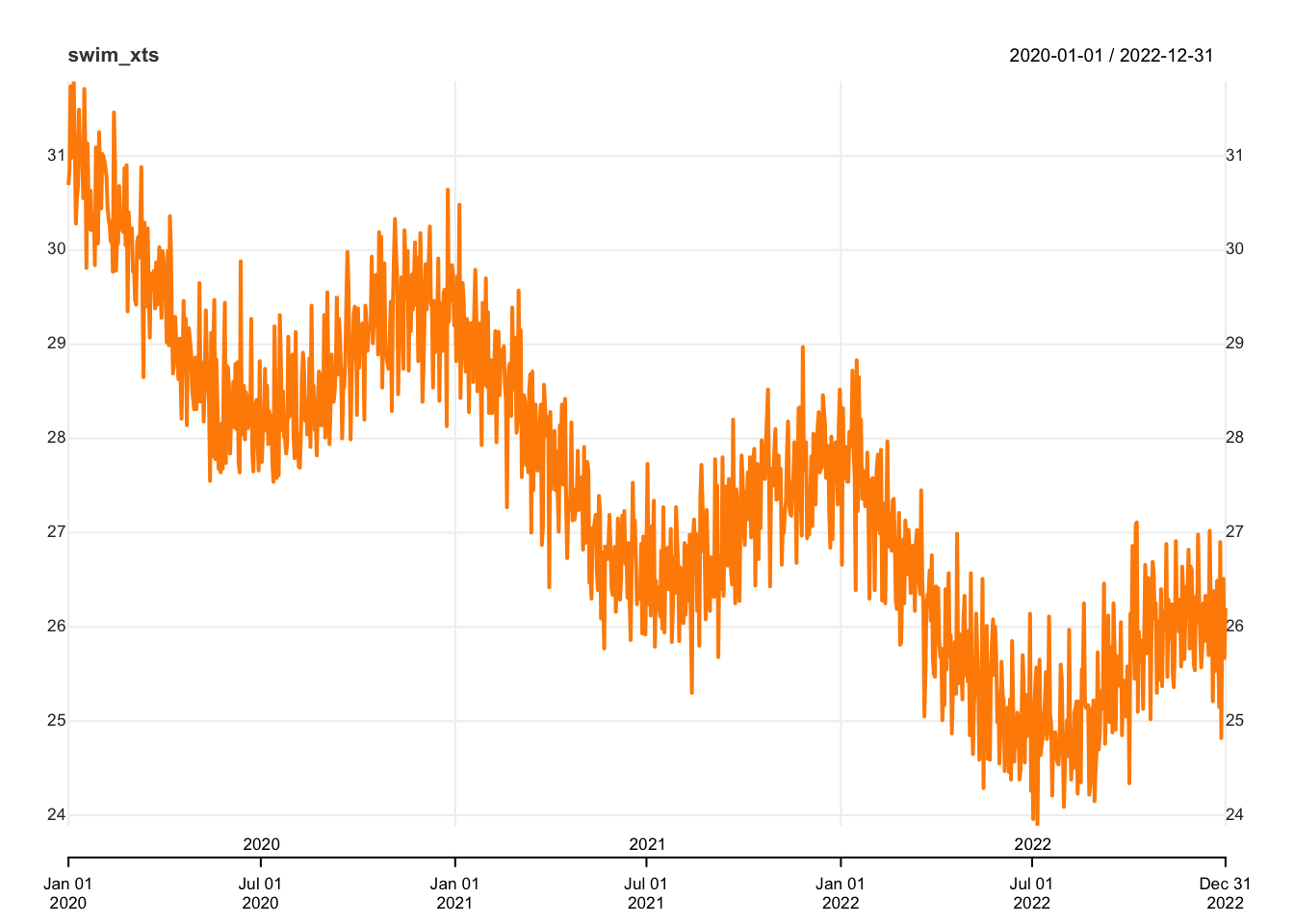
The choice between using an additive or multiplicative decomposition model depends on the nature of the time series data. The additive model is more appropriate for linear relationships where the seasonal fluctuations and trends are consistent over time. In contrast, the multiplicative model is better suited for nonlinear relationships where the seasonal effect varies proportionally with the level of the time series.

With our time-series data in an appropriate format (i.e., weekly) I’ll return to using the ts library.

weekly_ts <- ts(swim_xts_weekly_mean, frequency=52)

# Decompose using an additive model (assumes seasonal variations are constant)
decomp_result_add <- decompose(weekly_ts, type="additive")

# Decompose using a multiplicative model (assumes seasonal variations change proprtionally)
decomp_result_mult <- decompose(weekly_ts, type="multiplicative")

# Plot results
plot(decomp_result_add)

plot(decomp_result_mult)

This shows the trend, seasonal, and random components.

Recall: what do these tell us?

Classical decomposition: Practice

Load dataset

rm(decomp_result_add, decomp_result_mult, df, swim_xts, swim_xts_weekly_mean)
df <- read.csv('https://www.dropbox.com/scl/fi/kzfw4p1646azvsja6xrfr/tsa_forcast_01.csv?rlkey=zzyv9xoa36tvjclhnt0y6cggd&dl=1')

This dataset records monthly swimming pool attendance from 2010 to 2020.

Note that, again, the data includes a date/time variable. We don’t need this for time series analysis as R will automatically allocate a data/time based on the frequency we enter.

Prepare data

# first, extract only the attendance data
swim_data <- df$Attendance

# then, convert it to a time series object:
swim_ts <- ts(swim_data, start=c(2010, 1), frequency=12)

Plot data

plot(swim_ts, main="Monthly Swimming Pool Attendance", ylab="Attendance", xlab="Year")

Decompose the time series

decomposed_swim <- decompose(swim_ts)
plot(decomposed_swim)

STL decomposition: demonstration

In the previous example, we used classical decomposition. STL (Seasonal and Trend decomposition using Loess) is another versatile and robust method for decomposing time series.

As you know, classical decomposition separates a time series into trend, seasonal, and irregular components based on either an additive or multiplicative model. This assumes that the seasonal pattern repeats exactly over a fixed period and that the components are relatively stable over time, making it well-suited for series with stable seasonal effects and a clear trend.

On the other hand, STL decomposition offers a more flexible approach by using LOESS (locally estimated scatterplot smoothing) to extract the trend and seasonal components. Unlike classical decomposition, STL can handle data where the seasonal pattern changes over time and can adapt to the series’ level of noise.

It’s inherently additive, but can be adapted for series that seem to require a multiplicative approach through transformation. STL’s flexibility in adjusting the smoothness of the trend and seasonal components makes it particularly useful for complex series with evolving patterns.

Load EuStockMarkets dataset

First, I’ll load the DAX daily trading data. Using frequency = 260 creates a time-series object in which each set of 260 observations represents one year (to account for holidays, weekends etc.)

data("EuStockMarkets") # contains DAX index
eustock_ts <- ts(EuStockMarkets[, "DAX"], frequency=260)

Plot the time series

plot(eustock_ts, main="DAX Index", ylab="Index Value", xlab="Time")

Apply STL decomposition

stl_decomposed <- stl(eustock_ts, s.window="periodic")
plot(stl_decomposed)

Like classical decomposition, this also shows us the seasonal, trend, and remainder components.

However, STL decomposition is more flexible because it effectively handles various seasonal patterns, trends, and data anomalies without being confined to strict additive or multiplicative models. This makes it more suitable for complex, real-world time-series data.

61.3 Using Moving Averages

Moving averages, a form of smoothing technique, are useful tools in the analysis of time-series data. They highlight patterns in our data by mitigating noise and enhancing forecasting accuracy. These methods effectively ‘temper’ short-term oscillations to highlight more substantial trends or cycles within the data.

  • The simple moving average (SMA) presents a basic approach to data smoothing, deriving the unweighted mean from a set number of preceding data points. For instance, a 10-period SMA computes the average value over the preceding 10 periods.

  • Exponential Moving Averages** (EMA) introduce a layer of complexity over SMAs by allocating increased significance to more recent data points, increasing their responsiveness to new information. This makes EMAs particularly good at detecting recent shifts in the data.

Demonstration

library(TTR)

df <- read.csv('https://www.dropbox.com/scl/fi/wb3t67831oe2j71u4znmk/tsa_forecast_02.csv?rlkey=0fzluocavie5eci0c7s6efstv&dl=1')
head(df)
        Date Performance
1 2020-01-01       30.69
2 2020-01-02       30.85
3 2020-01-03       31.74
4 2020-01-04       30.98
5 2020-01-05       31.00
6 2020-01-06       31.79
data <- df$Performance

Calculating MA

With the TTR library loaded, I can calculate a simple moving average using the SMA function.

sma_values <- SMA(data, n = 12)  # 12-period moving average

# Plot
plot(data, type = "l", col = rgb(0, 0, 0, 0.3), xlab = "Time", ylab = "Value", main = "Original Data and 12-Period SMA")
lines(sma_values, col = "blue", lwd = 2)  # Plot SMA values in blue and thicker

# Legend
legend("topright", legend = c("Original Data", "12-Period SMA"), col = c(rgb(0, 0, 0, 0.3), "blue"), lty = 1, lwd = c(1, 2))

Calculating EMA

We can calculate an exponential moving average using the EMA function.

ema_values <- EMA(data, n = 12)  # 12-period exponential moving average

# Plot
plot(data, type = "l", col = rgb(0, 0, 0, 0.3), xlab = "Time", ylab = "Value", main = "Original Data and 12-Period EMA")
lines(ema_values, col = "red", lwd = 2) 

# Legend
legend("topright", legend = c("Original Data", "12-Period EMA"), col = c(rgb(0, 0, 0, 0.3), "red"), lty = 1, lwd = c(1, 2))

Visualisation

We can plot the original time series data alongside the SMA and EMA to compare the effects of these smoothing techniques.

plot(data, type = "l", col = rgb(0, 0, 0, 0.3), main = "MA and EMA Comparison", ylab = "Value")
    lines(sma_values, col = "red")
    lines(ema_values, col = "green")
    legend("topright", legend = c("Original", "SMA", "EMA"), col = c(rgb(0, 0, 0, 0.3), "red", "green"), lty = 1)

Shiny Example of MA Crossovers - Load separately

library(shiny)
library(TTR)
library(ggplot2)

# Define UI
ui <- fluidPage(
    # Application title
    titlePanel("SMA and EMA on Time-Series Data"),
    
    # Sidebar layout with input controls for two moving averages
    sidebarLayout(
        sidebarPanel(
            # Input: Select type of the first moving average
            selectInput("maType1", "Select First Moving Average Type:",
                        choices = c("Simple Moving Average" = "SMA", 
                                    "Exponential Moving Average" = "EMA")),
            # Input: Slider for the length of the first moving average
            sliderInput("maLength1", "Length of First Moving Average:",
                        min = 2, max = 50, value = 12),
            
            # Divider
            hr(),
            
            # Input: Select type of the second moving average
            selectInput("maType2", "Select Second Moving Average Type:",
                        choices = c("Simple Moving Average" = "SMA", 
                                    "Exponential Moving Average" = "EMA")),
            # Input: Slider for the length of the second moving average
            sliderInput("maLength2", "Length of Second Moving Average:",
                        min = 2, max = 50, value = 26)
        ),
        
        # Show a plot of the generated time series with the selected moving averages
        
        
        mainPanel(
   plotOutput("timeSeriesPlot", width = "100%", height = "600px")
)
        
    )
)

# Define server logic
server <- function(input, output) {
    
    # Generate a synthetic time series dataset
    syntheticData <- reactive({
        ts(rnorm(100, 20, 5), start = c(2020, 1), frequency = 12)
    })
    
    output$timeSeriesPlot <- renderPlot({
        data <- syntheticData()
        maType1 <- input$maType1
        maLength1 <- input$maLength1
        maType2 <- input$maType2
        maLength2 <- input$maLength2
        
        # Calculate the first moving average
        if (maType1 == "SMA") {
            maValues1 <- SMA(data, n = maLength1)
        } else if (maType1 == "EMA") {
            maValues1 <- EMA(data, n = maLength1)
        }
        
        # Calculate the second moving average
        if (maType2 == "SMA") {
            maValues2 <- SMA(data, n = maLength2)
        } else if (maType2 == "EMA") {
            maValues2 <- EMA(data, n = maLength2)
        }
        
        # Plot the original data and both moving averages
        plot(data, type = "l", col = "blue", main = "Time Series with Moving Averages", ylab = "Value", xlab = "Time")
        lines(maValues1, col = "red")
        lines(maValues2, col = "green")
        legend("topright", legend = c("Original Data", paste(maType1, maLength1), paste(maType2, maLength2)), col = c("blue", "red", "green"), lty = 1, cex = 0.8)
    })
}

# Run the application
shinyApp(ui = ui, server = server)
library(shiny)
library(tidyverse)
library(TTR) # For SMA and EMA

# Sample data frame
set.seed(123)
dates <- seq(as.Date("2020-01-01"), as.Date("2020-12-31"), by="day")
values <- rnorm(length(dates), mean = 100, sd = 10)
data <- data.frame(Date = dates, Value = values)

# Define UI
ui <- fluidPage(
  titlePanel("Dynamic Time Series Plot"),
  sidebarLayout(
    sidebarPanel(
      dateInput("startDate", "Start Date", value = min(data$Date), min = min(data$Date), max = max(data$Date)),
      dateInput("endDate", "End Date", value = max(data$Date), min = min(data$Date), max = max(data$Date)),
      numericInput("ma1", "Moving Average Period 1", value = 10, min = 1),
      numericInput("ma2", "Moving Average Period 2", value = 20, min = 1),
      selectInput("maType1", "MA Type 1", choices = c("SMA", "EMA")),
      selectInput("maType2", "MA Type 2", choices = c("SMA", "EMA"))
    ),
    mainPanel(
      plotOutput("timeSeriesPlot")
    )
  )
)

# Define server logic
server <- function(input, output) {
  output$timeSeriesPlot <- renderPlot({
    # Filter data based on selected dates
    filteredData <- data %>%
      filter(Date >= input$startDate & Date <= input$endDate)
    
    # Calculate moving averages
    if(input$maType1 == "SMA") {
      filteredData$MA1 <- SMA(filteredData$Value, n = input$ma1)
    } else {
      filteredData$MA1 <- EMA(filteredData$Value, n = input$ma1)
    }
    
    if(input$maType2 == "SMA") {
      filteredData$MA2 <- SMA(filteredData$Value, n = input$ma2)
    } else {
      filteredData$MA2 <- EMA(filteredData$Value, n = input$ma2)
    }
    
    # Plot
    ggplot(filteredData, aes(x = Date)) +
      geom_line(aes(y = Value), colour = "blue") +
      geom_line(aes(y = MA1), colour = "red") +
      geom_line(aes(y = MA2), colour = "green") +
      labs(title = "Time Series with Moving Averages", x = "Date", y = "Value") +
      theme_minimal()
  })
}

# Run the application 
shinyApp(ui = ui, server = server)